Tuesday, October 22, 2024

POP ART SELF PORTRAITS - 2024

 POP ART SELF PORTRAITS

Author: Melissa Hooker


For this project students will be tracing their own photos to make an Andy Warhol inspired Pop Art Self portrait. 

Click here to see the inspiration for this project. https://pin.it/4eFbtM3ZF


Supplies Needed: 

Messy Mat

9x11 white paper

Pencil

Black Marker 

Thin Black Marker

Color Wheel for each student

2 pieces of painters tape per student.  Stick them on the color wheel where students can peel them off (see photo below)

Oil Pastels 

Paper towel or wet wipe for each student


HOW I BEGIN EACH CLASS: 

   *this has proved successful for me, but its just an idea, you do you! 

  • -      -  Introduce yourself-who’s parent you are
  •         - Im not a teacher-so lets pratice how should I get your attention “class, class”, “quiet coyote”

  •      There are a lot of steps to this project, and we need to stick together so we all can finish on time. Sometimes with art, we get to take our time and do our own thing, but this is not one of those times. If you fall behind, you might not finish your project. I have done this project many times so I know how long each of these steps should take…..so I might encourage you to hurry up sometimes when you feel like you want to take your time…but its just because we only have a limited amount of time to make sure this whole project gets finished! 

  •         When I pick up my marker, pencil, oil pastel...., you will put yours down. When I put                     mine down, you can pick yours up.  


START PROJECT


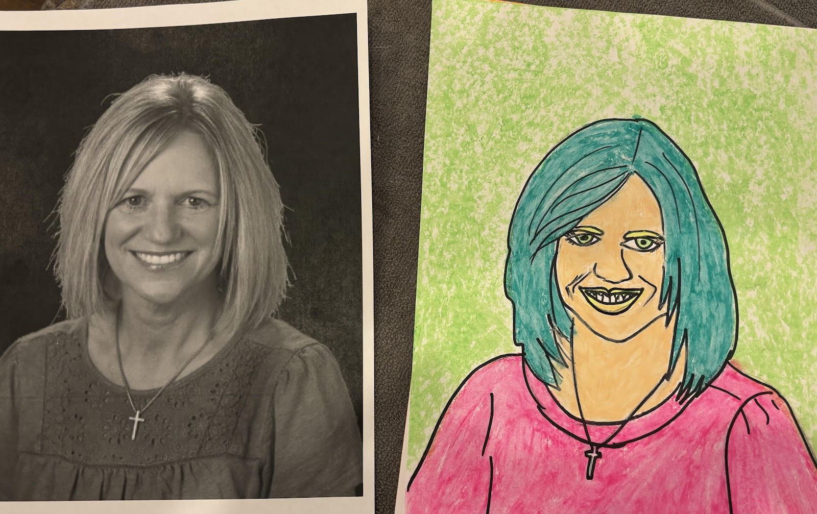
1.  SHOW THE FINISHED PROJECT OF WHAT THEY WILL CREATE

Each class has a teacher photo that is already finished. You can hang that up on the white board or just hold it up to show students how they will go from their black and white school photo to a bold, vibrant exciting self portrait that looks just like them!

2. HAVE STUDENTS FIND THEIR PHOTO

You can do this many ways. 

I think the easiest would be to just set out their photo onto a work space and when the students arrive, they can find their photo and that is where they will sit. If you would like students to be able to sit wherever they want, they you could have them get seated first and then have the photos laid out on the front table and call each desk group up individually to find their photo. 

 TK, Kinder, 1st- their photos will already be traced for them in black marker and ready to skip to coloring.  (also keep in mind these classes are only 45 minutes long)

2nd grade-their photos will be traced for them in pencil, and they will go over the pencil in black marker. 

3rd, 4th & 5th grade- they will be doing the entire project themselves so they will only have a photo to find. 


3. LABELING

Instead of writing their names on the back of their art work-We will have pre-printed name labels to be attached to the backside of their photos. Some classes may already be attached. For others, you will need to hand those out. This would be a great job for a parent helper or teacher to walk around and help students attach their label at any part during the project. 

For 3rd, 4th & 5th the recommendation is to wait until they are finished with the black marker part of the project to pass these out in case you need to have any "re-dos" 


3. TRACING

TK, K, 1st- They will not be tracing but you can talk with them about how an adult used their photo and traced their face. you can show them how did this by demonstrating on a window. Some of these photos have black marker ON the photo which made tracing easier, some of them don't. (skip to coloring)

2nd-Do above and then have them start by tracing the pencil lines with their black marker. For Teeth- we highly recommend having them switch to the thin marker!  I would give them 5 minutes for this. (skip to coloring)

3rd, 4th, 5th- You will demonstrate the process for them. **TIP** While doing this I found that if I first traced directly onto their photo, it was SO MUCH EASIER to see it through our thick art paper. You don't have to trace every single part...but the parts of the face below would be very helpful!!  Have them do each of these steps together so you can move through this quickly. Wherever there is dark to light contrast on the photo you will be able to see easily through the paper, where there is light on light...that is where this pre-tracing will be helpful.  (SEE PHOTOS BELOW) 

-hair line

-eyebrows

-eyes (pupils should be colored in black)

-nose 

-smile lines

-lips

-teeth- switch to thin marker here 

I probably would have the girl below trace her bow and also the full outline of her ears. 


Above you will see the difference this pre-tracing makes by looking at the jacket of this student. On the right side it's easy to see all the lines to trace, on the left side it's much harder. As long as you can move through the pre-tracing quickly, I think this is worth the time spent to avoid frustration over not being able to make out traceable features. (lessons learned after tracing 100 photos!) 


4. FINDING A LIGHT SOURCE TO START TRACING -Allow about 10 min.  to find a spot & trace!

Give students two piece of painters tape. They will tape their photo to the window first and then their white piece of paper over top. Try to have them center it.  You can have students leave the classroom to find an open window- probably best to sent a parent helper along too! :) 

BEGIN TRACING WITH PENCIL !! I would allow no more than 6-7 minutes for this step. I might walk them through each step here (example: now we will trace our hair line, now we will trace our eyebrows....and for other classes, I may just have them go ahead.) 

An important point here is that we are not taking every single itty bitty detail. Just the main details!! No need to trace any shirt details. 

When the student is finished have them take their tracing off the window and double check that they traced everything before going back to their seat. Make sure they have a jaw line, eyeballs, etc. It's funny what you can miss. 

5. RETURN TO YOUR SEAT AND TRACE YOUR PENCIL WITH BLACK MARKER - 5 minutes

*switch to the thin marker for teeth 


LETS LEARN ABOUT ANDY WARHOL   1st Grade & up! 

After tracing & coloring many photos, I figured out that if you trace and then go straight into coloring the marker has a tendency to smear. So, so give the marker a little bit of time to dry, I am going to stop here and ask them to put their markers down and talk a little bit about Andy Warhol. I have found that the students stay more engaged if I am the one sharing the information on the artist instead of having them watch a video. So I did research, got a lot of my information from this video here: https://youtu.be/DI5P_67AGgY?si=13C4IRlj6JkE7BZR and am going to talk about the points below. I think it would be a huge success if our students came out knowing the name Andy Warhol and also being able to recognize art inspired by him!! 

I am going to show the powerpoint I emailed to each to you while I speak. There are also notes in the "notes section" of the power point. 

Andy Warhol was a famous artist and is considered to be one of the most important American Artists in our history. He was born in Pittsburg Pennsylvania. When he was a little boy he loved to color and his mom rewarded him with chocolate when he finished coloring a page in his coloring book.  He loved his mom so much that when he was older and moved out of his home, his mom moved in with him and lived with him until he was 43 years old. 

When he was 9 years old, he got very sick with a disease called Chorea (core-e-uh). It's a nervous disorder and it left him in bed for many months. The Chorea disease  caused Andy's skin and hair to lose pigment/color. That is why when you see a photo of him, his hair is always very white! 

During that time, sick in bed, he spent a lot of time reading superman comic's, watching movies, coloring in his coloring books.  It was during this time that Andy became obsessed with famous celebrities and wanted to become one himself. When he became an adult, Andy said he credits this time in life for his artist inspiration. 


In the 1940’s our country was at war and the type of art being created looked like this . One type was called realism because It looked very realistic, showed people doing every day jobs. The other type was called abstract- which does not look like anything real. 


In the 1950’s people were tired of what they called “boring drab art” and a new type of art emerged, called POP ART. Andy Warhol became one of the leading artists of a type of art called Pop Art. Pop stands for popular. Andy Warhol made art showing things that were really popular at the time. Things like celebrities, !!! What made his art so different was the use of really bold bright colors. 


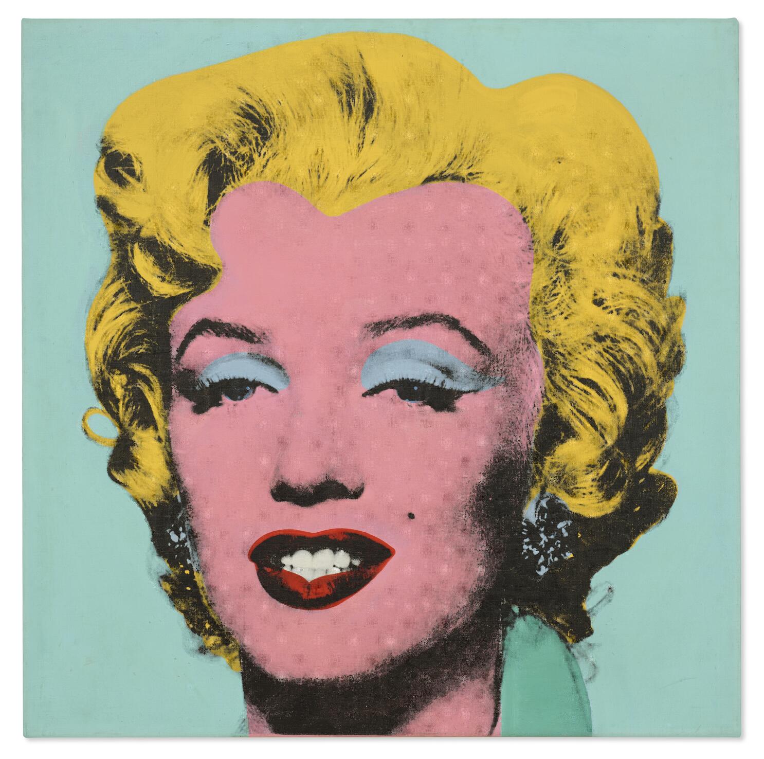
Marilyn Monroe was VERY popular during this time. She was one of the most famous faces in the world. 


Andy Warhol took a photo of Marilyn Monroe and created this painting to the right. It’s called Shot Sage Blue Marilyn. This painting became very famous. 

Andy Warhol became one of the leading artists of a type of art called Pop Art. Pop stands for popular. Andy Warhol made art showing things that were really popular at the time. Things like celebrities, cartoons like Mickey Mouse and even cans of soup!! What made his art so different was the use of really bold bright colors. 

The other thing that made his art different is that he would copy his art over and over and then re-color it in a different way. Then he would hang those same pictures but different colors up together.  by Andy Warhol. He did it with Marilyn Monroe, Mickey Mouse & Even Campbells Soup cans. 


This is NOT done by Andy Warhol but if you ever see a painting that looks like this with the same image over and over in different colors….that is art inspired by andy Warhol! 


If you wanted to buy one of Andy Warhol's original art pieces, like this one called Shot Sage Blue Marylin, you would have to pay 195 million dollars. That's how much it sold for in 2022. It's the most expensive art work ever sold by an American Artist! 


Now let's move on to coloring our own self portrait in the bold fun bright colors like Andy Warhol used! And when we hang them up all together, it's going to look like a big huge Andy Warhol painting! 

6. COLORING - leave yourself about 30 minutes for the coloring!

Students will be using bright neon oil pastels for coloring! When working with oil pastels, I like to remind students that these "look like crayons and somewhat act like crayons, but they are NOT crayons"  They are much softer and the really special part is that they can be blended in with your finger so you don't see any coloring marks. Students should use medium pressure with oil pastels and not color every single white space. This is a great time for parent helpers to walk around and show students how to blend oil pastels with their finger. Make sure you have a paper towel at each desk setting for wiping dirty fingers. 


7. BEGIN WITH SKIN

To make us look more realistic and allow all the other fun details to pop, we will be using flesh colored oil pastels for our skin.  Each station will already have pale colored oil pastels because we have a lot of those, but we also have a few boxes of various skin colored oil pastels. (olive tones, browns, blacks) Hand those out as needed. Keep in mind students can combine two colors together to create a different tone if needed. 


8. HAIR

move to hair next and get that all colored. 

9. BACKGROUND

*when we practiced these during our Teaching Team Meeting, we gave the option of using either oil pastels in the background OR tempura paints. However, we have rethought that and we are only going to do oil pastels. They are much brighter and bolder and we think they look better! 

When students have finished their hair, have them look at their color wheel and find a "complementary color". A complementary color is opposite whatever color their hair is. If they colored their hair pink then Green, yellow or light blue is on the opposite side and would make the best background color. It will help their face/hair pop off the page. 

The best way to color the background is to use a small piece of an oil pastel and use the long side of it. It will cover a lot more space! Encourage creativity here. If students want to add some flair to their background, they are welcome to. 

10. WHAT TO KEEP WHITE?

Teeth & the Whites of the eyes should be kept white! All other features are fair game for coloring

11. ALL OTHER FEATURES

we have found the best look is to keep eyes a "normal eye color" - so blue or green. You may suggest this and then allow students to do as they wish. 

Any color's for clothing, eyebrows, lips,  will work great. Students can get creative here. 

12. ADD LABELS TO THE BACKSIDE OF THE SELF PORTRAIT

13. NAME/SIGNATURE CARD

Pass out a slip of paper to each student and have them either write or sign their name. First name, last initial would be perfect! Then use a paperclip to attach the signature card to the picture and place in the drying rack. 


Saturday, March 2, 2024

4th Grade Pop Art Paper Pizza Pillows


POP ART 

PAPER PIZZA PILLOWS 

(Claus Oldenburg Style) 


SUPPLES

  • White paper
  • Brown craft paper
  • pencil
  • staplers (as many as you can borrow from teachers)
  • staples
  • scissors
  • ruler
  • blank newspaper from the roll
  • Crayola Marker packs 
  • large paintbrushes
  • red paint
  • paper plates
  • Elmers glue
  • shredded cheese (yellow shredded paper)
  • pizza toppings (construction paper strips)

Begin the class by briefly explaining the pop history below & show this video while you are talking to show some famous pop art works. (There is no sound on this video) 


POP ART HISTORY 

Pop art is an art movement that emerged in the 1950s. It came as a reaction to the more serious looking art that came before it in the 1930s and 40s. Pop art is meant to be fun, bright, and attention getting. It uses images and icons that are common place or popular....Hence the name Pop Art. Well-known celebrities & movie stars are shown in pop art and also commercial items like soup cans, and soft drinks, comic books, and any other items that are popular in the world can be considered pop art. 

One artist in the pop art movement named Claes Oldenburg (pronounced like Cloud but take off the D at the end and add an S) became best known for his work of giant sculptures of everyday objects. Let's watch this short video to see some of them. 

https://youtu.be/WOCrUwLgglE?si=ury3r012OWxtvUzm

Today we are going to create our own giant sculptures of the most popular food item in America...PIZZA!!!!!  

Wednesday, February 14, 2024

1st Grade: Monet


Supplies needed: 

  • Pre cut to size mixed media paper

  • Strips of blue, light blue, and pink tissue paper for pond background

  • Larger pieces of pink, green, yellow tissue paper for water lilies

  • Small cup of glue/water mix

  • Paint brush

  • Each table will have a pre-assembled tray of the tissue paper that will be used for the project for the kids to share- there will be a back stock of tissue paper for replenishing if needed!


Set up will look like this:


A little background:


This simple Monet art project is a lot of fun to make and really helps capture this famous impressionist artwork style. He was worried less about how things looked exactly, and more about the basic feel – the impression the scene left on the viewer. He did several different scenes, but he particularly enjoyed painting his pond filled with lilies. In fact, Claud Monet painted 250 water lily paintings! This water lily art project perfectly captures this famous French artist in a memorable way! Here are some examples:


So first you are going to make sure your paper is in landscape position for a nice big pond! We are going to work in sections from top of the page to the bottom. Remember we are working quickly and are worried less about how things looked exactly, and more about the basic feel! 


Let’s start with our pond- we need some water! 


We are going to take our paint brush and dip it into our glue solution then paint a line across the TOP of our paper. 


Then taking our blue strips of tissue paper you are going to place it onto the glue. From here while your glue is still wet, we will add more blue strips to complete our first section. 


We will repeat the process of painting a glue stripe all the way across the page right below our first layer of tissue paper. Now adding more blue or even a pop of light blue or pink for some highlights and movement in your pond. It is ok to overlap your pieces some just try not to layer directly on top of each other. 


Yours should start to look something like this:


As we complete our water you may notice some tissue paper hanging off of your paper- that is okay and will create that movement and texture that we want! 


Next step is water lilies! First we will need to make the lily pad. We will take the piece of the green tissue paper and give that a scrunch! Un fold your green tissue paper and take a look. Shape and form your lily pad to how you’d like. You may want to tear a little off of a corner to make it more rounded or leave it as is! 


Remember we are not worried about it looking exact and perfect, it is more about the feel! 


Let’s attach our lily pad by dipping our paintbrush into our glue solution and placing a dot where we’d like our first lily pad to go. Then place your lily pad. 


Should look something like this:


Next we will create our water lilies by taking pink tissue paper and giving it a scrunch for added texture. Then we will pinch in the middle of the tissue paper to create the center of our flower. 


Go ahead and grab your paint brush and add a glue dot to the lily pad where you’d like your flower to go. You can either use your fingers and place it on the glue dot or use the end of your paint brush to keep the petals off the paper and secure only the middle of your flower. 


Like this:


Next we will create more interest by adding more layers to your water lilly! Using the same process, we added more pink, and then some yellow for the center to pull it all together! 


Adding more lilly pads and waterlilies to your piece will keep your eye moving and create visual interest in your artwork! 


Using various sizes of lily pads and water lilies will create depth and make for the perfect masterpiece, no two alike! Have fun and remember it’s not about being exact, it’s about the feel! 


Enjoy!!


Wednesday, February 7, 2024

2nd grade: Pointillism painting (Spring project)

Second graders will learn about Georges Seurat and the art technique called pointillism in this lesson. Hopefully they will be inspired and will enjoy making their own pointillism painting! 

Georges Seurat was an artist who lived in Paris, France in the late 1800’s. He started to explore the science of optics and color in his artwork and developed the style of Pointillism. Instead of mixing colors together on a paint palette or canvas, he experimented with creating tiny dots of color next to each other on a canvas. This would trick your eye into mixing the colors together to form the picture. When you look at Seurat’s paintings up close you can see all the tiny dots and individual colors, as you move farther away, your eyes blend the colors together and you can see the image as a whole.


This is one of Georges Seurat's most famous paintings. "A Sunday Afternoon on the Island of Grande Jatte" completed in 1884. This painting took 2 years to finish! 

Here is a brief video you can play at the beginning of the lesson for the students to learn a bit about Georges Seurat and to see a few of his famous paintings. 


Supplies needed: 

  • Half sheets of mixed media paper (there should be a bin of paper that is cut for you, it will be about the size of a normal 8x11 sheet of paper) I did the example on the full sized paper and it took me forever!! ;) half sheets will be plenty for them!
  • Pencil
  • Paint palette with two shades of blue, two shades of green, yellow, orange, pink and purple
  • Q-tips, at least 10 per student, they may need more as they work 
*Be aware that this dot technique does take some time and anticipate this project to take the whole class time. Try to keep the project moving along and if they aren't completely filling in all of the white spaces, it's ok. Just move on to the next section and keep going! 


1. Have students write their name and teacher’s name on the back of their paper. Turn the paper over and draw an arch on one side of the paper that will be one of the hills. 


2. Draw another arch for the other hill. 


3. Now draw a third arch in between the two hills that will be the base for the sun. 


4. Now draw lines coming out from the sun that go all the way to the edge of the paper. I drew 7 lines, but I would recommend drawing 8 lines... that way the sections on the horizon will be the same color (either both can be sky or both can be sun rays). Mine turned out ok but I would like it better if it was symmetrical! ;) 


5. Now we are ready to start our pointillism technique! Lightly dip the q-tip into the paint and dot it on the paper. First we will do a few flowers scattered on the hills. Start with pink and make a few clusters. 


6. Now pick up a different q-tip and fill in the clusters with dots of purple. 


7. You don't want too much white showing through, so decide which color you want to fill in the spots with. 


8. Now we will move on to filling in the grass! Lets start with the darker color of green and then move to the lighter color. 


9. Continue making dots all over the hills with the two different greens. You can switch back and forth but just keep doing dots to get the look of pointillism. Don't spread the paint around with the q-tip as tempting as it is! :)


10. Next we will plan out which colors we will paint the sky. You will want the sky to have an alternating pattern of blue sections for the sky and yellow sections for the sun. Make a couple of dots of the color each section will be so you don't get confused or accidentally color in the wrong color on a section.  


11. Decide which section you want to work on first and start dotting! You can start with either the darker color or lighter color. You may go back and forth between the colors or layer over a bit to get most of the white spaces filled in. 


The finished product! Note how this example has one section that has sun rays on the horizon and one section is blue sky ;) 


Ideas for this project were inspired from : Simple Pointillism for Kids Art project - Projects with Kids


Saturday, January 20, 2024

3rd Grade VanGogh Starry Night/SunFlower Mashup (Spring Project)


Supplies needed:
  • Large messy mat's laid vertical 
  • White mixed media paper
  • Water bowl/Sponge
  • Large Paintbrushes
  • Small paintbrushes
  • Black Markers
  • Pencils
  • Paper towel
  • Paper plate with paint: 2 wells of Blue, yellow, orange, brown, tan, white, small amount black


IMPORTANT NOTES:

  • Start this lesson with a 1 minute tutorial of how to properly clean a paintbrush in water & wipe the excess on the sponge.
  • This lesson involves paint mixing for specific colors.
  • The order of this lesson is fairly specific - going back and forth between the upper part of the painting and the lower part to allow for some dry time in between.

1. Write name & teacher name on paper.


2. Turn paper vertical like a tall building.


3. Using a light piece of chalk, make a mark at the bottom one third of the paper.


4. With a thick flat brush paint the upper 2/3 of the paper blue. This tempura paint is slightly translucent, so we want to make sure to use a lot of paint here so it’s a nice dark blue when it dries. About 1.5 wells of color.


5. Clean Brush thoroughly.


6. The bottom 1/3 will be painted Green. Paint in small strokes back and forth and look like grass. Go over top of the blue a little bit…this will create a darker horizon in the back we will work on later.

1 well blue + 1 well yellow = mix on plate for 30 seconds


7. While taking a moment to let the paint dry a little bit, we will show the 4 minute video on Vincent VanGogh!


Starry Nights & Sunflower are worth 100 million dollars if sold today! If you ever want to see the the original Starry Nights painting, it is in the Museum of Modern Art in New York City! The original Sunflowers painting is in the National Gallery in London. 


8. SWIRLS

Dip a clean large round brush into the white paint and start to make two swirls across the page. Your students can first use a piece of chalk to mark out the swirl if they would like to, or they can just go for it with the paint. The blue paint won't be completely dry yet so as they make the swirls/wind thicker and more wispy the white will mix with the blue a little to create a light blue color. That is exactly what we want.


9. STARS

Using what paint is left on the brush, make a couple of "stars" in the sky as well with that light blue color.


10. HORIZON LINE

Using the small flat brush, mix a dark color for horizon line. Use short brush stokes that from far away will look a little bit like trees.

1 scoop blue + 1 scoop green + 1 dab black/brown


11. SKETCH SEED

Using a piece of chalk, we will mark out the middle of our sunflowers (the seed). 2-3 large sunflowers will be best and students can choose where to place them. Just have them be far enough apart that it leaves room for the leaves.


12. PAINT SEED 

Using a clean large round brush mix a dark chocolate brown for seed of sunflower. paint over the chalk and fill in the seed of the sunflower. It may be slightly opaque so have students use a fairly thick layer of paint here.

2 scoop brown + orange + yellow + tan + mix on paper plate


13. WIND & STAR BRUSH STROKES-TURQUOISE

Using a small flat brush we will now make turquoise paint using blue and green - NEED TO FIGURE OUT THE RATIO HERE!

Using a small, pointed brush use a light blue color for our first set of wind/sky/star brush strokes. These will be unique to each student but have students watch you first before doing it themselves. Help them to understand the movement of the sky and to keep brushstrokes going in the movement that makes sense.


15. REPEAT PROCES WITH LIGHTER TOURQUOISE & BRIGHT WHITE

Make sure to make a white dot in center of star


16. SUNFLOWER PETALS

Using the large round brush mix an orangish color for the petals.

2 scoop orange + 2 scoop yellow + 1 scoop brown

*****WIPE ACESS OFF BRUSH WITH PAPER TOWEL******

Now put some of that just mixed orangish paint on the same large round brush to make the sunflower leaves. This will be the first layer of leaves, so its ok if its opaque. Start on the inside close to the seed and then flick the brush out toward the end to the leaf looks more realistic. Do this on all flowers. The brown seed part will not be completely dry so its ok if your brush picks up some of the brown, it will create a difference is leaf shade which will help the flower again look more realistic.


16. STAR GLOW

Using a small, pointed brush and plain bright yellow, make your stars glow.


17. INNER SUNFLOWER PETALS

Using the large round brush (and maybe even a smaller brush) and the plain bright yellow, create the inside petals of the sunflower. Again, the colors are going to run together and that is what we want.


POP ART SELF PORTRAITS - 2024

 POP ART SELF PORTRAITS Author: Melissa Hooker For this project students will be tracing their own photos to make an Andy Warhol inspired Po...